Feedbackbulb for Swift
Add dependency
Using the Swift Package Manager, add a reference to the Feedbackbulb library at https://github.com/Headbright/feedbackbulb-swift.
The library contains two targets Feedbackbulb and Feedbackbulb.Toolbox.
Feedbackbulbbrings the core functionality needed to send feedback reports programatically. Pick this if you're integrating into your own UI.Feedbackbulb.Toolboxbrings pre-built feedback components ready to use in your app. Pick this if you want to get started quickly using one of our example UIs.
You only need to add one of the two targets to your project.
Sending feedback programatically
import Feedbackbulb

// create an instance of a FeedbackSDKClient providing your app key
var feedbackClient = FeedbackSDKClient(appKey: "XX-XXX-XXXX")

// optionally, enable debugging if you want to see the network requests during development
#if DEBUG
    feedbackClient.debugOn()
#endif


// gather information about your app to be attached to the feedback report
let attributes = FeedbackEnvironmentObserver().describeCurrentEnvironment()


// submit the feedback report
try await client.submitFeedback(content: feedbackText, attrs: attributes)

// submit feedback with an attachment, for example a screenshot
try await client.submitFeedback(
      content: feedbackText, fileName: "screenshot.jpg", file: imageData, mimeType: "image/jpeg",
      attrs: attributes)
Sending feedback using the Toolbox
INFO
The Toolbox is available for iOS (iPadOS) 15.5+ and Mac Catalyst 16+ targets only.
In SwiftUI, create a wrapper view to hold the logic for displaying and dismissing the feedback widget. It's all just regular SwiftUI code except for SimpleFeedbackForm which comes from the Feedbackbulb.Toolbox:
import Feedbackbulb_Toolbox

struct PresentingSheetView: View {
  @Environment(\.dismiss) private var dismiss
  var body: some View {
    NavigationStack {
        //TODO: - Replace with your API key
        SimpleFeedbackForm(appKey: "XX-XXX-XXXX")
        .toolbar {
          ToolbarItem(placement: .cancellationAction) {
            Button("Dismiss", action: {dismiss()})
          }
        }
    }
  }
}
You can retrieve your app key from the Feedbackbulb app dashboard
In your app, when needed, display the feedback widget as a sheet:
...
.sheet(isPresented: $showFeedback,
           content: { PresentingSheetView() })
Configure the Toolbox widget
The widget allows several configuration options to be changed with the aid of SimpleFeedbackConfig. You can show or hide different components or change the text labels.
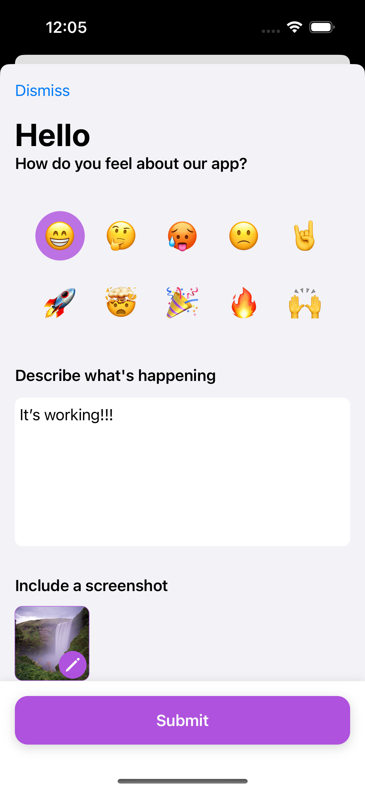
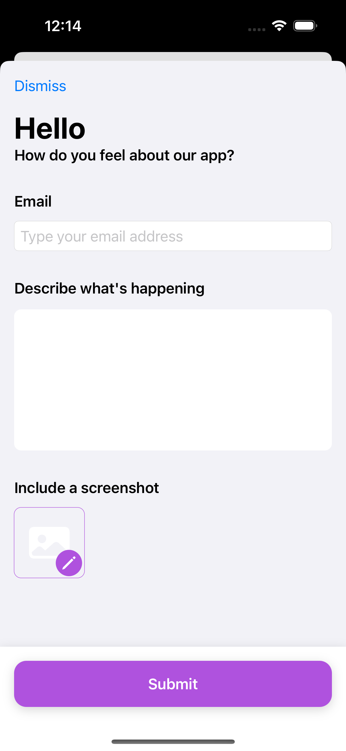
title- String, defaults to "Send feedback",subtitle- String, defaults to "We'd love to hear from you",textLabel- String, defaults to "Describe what's happening",textDescription- String, defaults to "Remember not to include personal information.",textAccessibilityLabel- String, defaults to "Enter feedback",submitButtonLabel- String, defaults to "Submit",showEmail- Bool, defaults to false,emailLabel- String, defaults to "Email",emailPlaceholder- String, defaults to "Type your email address",debugRequests- Bool, defaults to true,showAddImage- Bool, defaults to true,addImageLabel- String, defaults to "Include a screenshot"showEmojiPicker- Bool, defaults to false,emojiPickerLabel- String, defaults to "How do you feel about this app?"emojis- [String], defaults to ["😁", "🤔", "🥵", "🙁", "🤘", "🚀", "🤯", "🎉", "🔥", "🙌"],pinSubmitButton- Bool, defaults to false
Example usage:
SimpleFeedbackForm(appKey: "XX-XXX-XXXX",
                   config: .init(title: "Hello",
                   subtitle: "How do you feel about our app?",
                   textDescription: "",
                   showEmail: true)
)
Toolbox preview
Here's a preview of the SimpleFeedbackForm we provide out of the box: